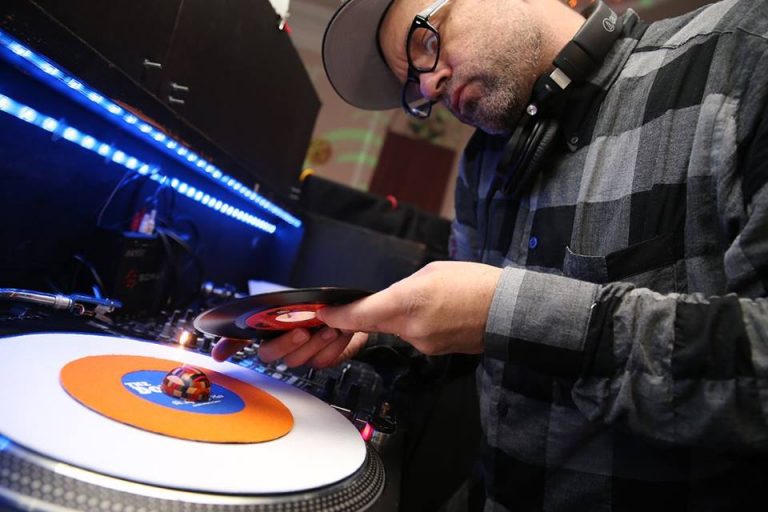
When you think about record labels and buying their releases, the first things that come to mind are what label is it, who’s the artists and is it a 12″, LP or 45 with little thought on who tied the entire project together visually with the label design and cover artwork. If you look at great cover art and labels of years past weather it be in the Jazz genre with Blue Note or CTI or in the Hip Hop realm, art and photography was obviously an important factor and a major selling point. From the simple and unique cover art on “The Turnaround” by Hank Mobley to the heavy graffiti inspired party setting of Mantronix “Needle To Groove”, both are equally powerful and both designed by respected individuals in their fields. Although most buy vinyl for the music alone, others buy for the art of it all and the attention to detail within the entire package which is why here on our second installment of “Diggin Art” we’ve caught up with DJ and graphic designer Mo Manley who has become an important asset within the industry and a go to guy on bringing a visual appeal to match a sound and feeling.
What inspires your design work?
Wow, that would be a long list if I really sat down and thought about it, because I tend to wander around marveling at stuff in general all the time. The short list of stuff I can always go to—strictly design speaking—would be a lot of the midcentury graphic designers like Max Huber and Bradbury Thompson, plus some studios that have made their marks over the years, like Grapus, Tomato, M&Co and 8vo. Typography in almost any form or location is inspiring to me, and certain movie titles. I could watch the opening titles for Jazz On A Summer’s Day every day—filming water to be animated abstract art is pretty simple and brilliant. Speaking of film and design, there’s a great book on the artwork of the Criterion Collection that’s worth picking up for sure.
How do you begin the process of creating works?
I often don’t have a super distinct “beginning” to my work, as in sitting down at the desk and starting cold. I usually have some period of time where I’ll sketch ideas out or will take a picture of some nice type I see on the street, and will pin those up on the wall to hang out for a while. I use index cards a lot—early on in a project I’ll work with a stack of index cards and a Sharpie, and sort of stream-of-consciousness write and draw on the back (blank) sides until the stack is gone and see what falls out of it. I typically move from “doodling” to a more concentrated process without me really realizing it. Walking around and simply looking at things is probably a pretty big part of the process, too—I take a lot of walks with coffee. I always go to the computer last—I can’t stand looking at a screen waiting for something to happen, so I only go to the computer once I have some concepts to throw at it.
Does music play a factor in your creating process of doing art and vice versa when out DJing?
I can’t think of many things in my life where music isn’t a factor! Seriously, it’s pretty much lifeblood for me, so yeah, definitely, there’s always something on while I’m working. As far as the other way around, there’s definitely been times where the gigs have influenced something visual later, too, but maybe not in the way you may think—it’s been more about stuff that I’ve overheard or seen at a gig that triggers an idea for later, moreso than the music that I (or someone else) is explicitly playing.
We’re all inspired or influenced by something that catches our attention and return we build and create from that. How do you balance out coming up with your own ideas versus sampling and flipping something from another source and making it your own?
I love this question! Can I take a minute and answer this one at length? Because I think about this all the time.
First up, there’s a long history of designers playing at that line between “homage” or reference and plainly biting it—and usually doing a clunky job with the bite. That move kinda bums me out because if someone does something super clumsy with their ripoff they then usually play it off like it was an intentionally clumsy reference to the original, and play it like they mean it to be tongue-in-cheek, like “hahaha just playin, fam!” That’s pretty lame. If you’re going to bite, at least own up to it.
To make things worse, it seems that the game for some designers is to find more and more esoteric sources to rip off as a way to show that you’re knowledgeable about your sources, and think people will never catch on that their work is a ripoff—kind of like “Snobby Recycling,” which is pretty lame, too. As a weird kind of hobby, I’ve been keeping a folder of “Originals vs Knockoffs” for nearly 20 years now for anytime I find these kinds of samplings. One of these days I should make a book…
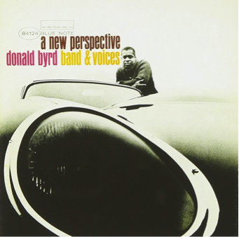
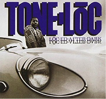
Anyways, there’s a ton of super easy bites to spot, like Donald Byrd vs Tone Loc (man Tone-Loc’s cover is super cheap-o compared to the Byrd cover!):
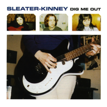
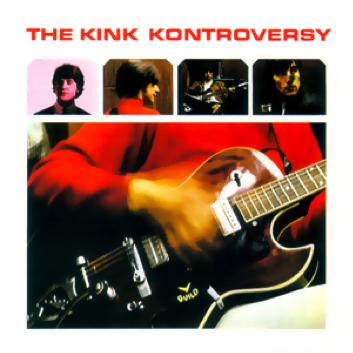
or Sleater-Kinney ripping off The Kinks:
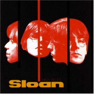
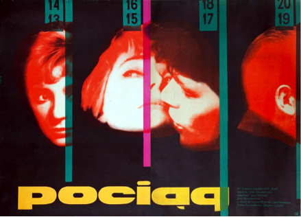
But one of my favorite esoteric ones where I imagine some designer somewhere was thinking, “ha! no one will ever know!” is when the Canadian band Sloan ripped off this (admittedly great) movie poster for the 1959 Polish film Pociąg:
Anyways—I feel like the better and more thorough we are at archiving and recording everything, the greater the temptation is to just mine the past versus making up wholly new things. I’ve done my fair share of “nudge nudge wink wink” stuff with making clone 45 labels that refer back to earlier labels—for Funk Night I’ve made direct clones of the WIRL and Colossus labels, for example, and have definitely made references back to others, as well. While that’s part of the visual scene in the record game—and I don’t mind doing one every once in a while, because they’re their own sort of fun to see if you can replicate it—I also feel like that’s always a missed opportunity to go off and do something completely new.
As far as balancing it out between New vs Homage…there are days (and I’ve done this with whole design teams in studios I’ve worked at, too) where I’ll literally go on media blackout; no Internet, no books, no reference files, no nothing, and force myself to look inside to come up with something new from scratch. It’s just way too easy to end up comping something that looks suspiciously like your last favorite thing you saw on Tumblr or something, even if you weren’t consciously setting out for that to happen.
You’ve been all over the place lately designing for various record companies especially for Funk Night. What are some of the challenges you run into when designing labels so that it feels like what you’re going to hear from the music?
Visualizing music can be tough because trying to represent music is a subjective thing—which I think sometimes also encourages for people to lean on easy/known visual stereotypes to help people quickly assume on the music without much effort (like ripping off a Blue Note cover to generically say “jazz”) versus trying to come up with something new that people have to work to interpret from scratch.
I think the biggest challenge is when you hear—and then see—something that you think feels so right to the music, and yet is so not what the artist or label hears/sees/is feeling. That happened to me recently—I put down several 12” concepts for a record I was really excited about, but the label was 180˚ from where my head was, so they passed on all of the concepts and ended up going with someone else….and while the cover that ended up coming out was a great composition and I dug it, it didn’t represent anything that I personally heard. It’s all good, though—that’s part of the design game, and happens to everyone occasionally. All you can do is keep it moving and get at it again tomorrow.
Out of all of the label projects you’ve worked on, which 45 design stands out as your favorite?
While I don’t think I’ve hit one big favorite, I did dig the gospel series I did for Funk Night…there was one in there that was a ripoff of the old Hob “HOB IS GOSPEL” label, but the others in that series all had these little ink doodles of sparrows and praying hands that I did absent-mindedly while I was on a really annoying conference call (that I probably should have been paying more attention to than I was). There’s a couple new picsleeves coming out on Funk Night that I think are going to look crisp in the racks, and a series of three different hand-screened 7” covers that will work together as one large piece that I’m pretty excited to put down, also.
More than having One Big Favorite, though, is that I like some of the touches that I’ve done here and there across labels. I tend to put a lot of little details or messages on the labels for people who take the time to look to find. There’s always a reason for these Easter Eggs, so it’s fun to think up something a little mysterious to put on there for people to wonder about.
In between your day to day of design work, you’re also still traveling and DJ’ing as well. What can people expect to hear from you when they come out to see you play?
I’m a sucker for the drums, so you’re always going to hear a lot of percussion coming from me—not just the sample-friendly breaks, but records that have tons of congas, shakers, handclaps, triangles, whatever, that keep the pulse going. I’ve always wandered across funk/soul/disco/Latin/jazz in my sets, so that’s never going to change—gotta keep it interesting for the floor. It’s also going to be on wax—not to get into an analog vs digital debate (it’s all fine, and nobody really cares, anyway), but I’ve never played a Serato gig in public and I’m not really inclined to start now. I spend most of my days looking at a computer, so the last thing I feel like doing in the club is staring at one for several hours more.