In the music world and especially when pressing records is concerned, the person behind the visual representation of an artist often goes overlooked and sometimes uncredited. After all, we buy music based on what our ears appreciate and not necessarily what the cover design looks like. But over the last few years, there has been a marriage of sorts, a common appreciation between the art and the artist, musician and product designer working hand in hand making each piece of the puzzle equally as important. One graphic designer who seems to have his hands in multiple projects and has gained the respect of labels, MC’s and DJ’s alike is Mr. Krum. His magic can be found on a slew of vinyl covers from some of our favorite artists and labels producing records today. I recently caught up with Mr. Krum to get the 411 on past and present projects, what inspires his creativity, what he’s listening to and of course, as a collector, what’s he’s digging for these days.
Skeme: For the record, state your name, location and occupation.
Mr. Krum: Darrell Krum (Mr. Krum) / Hometown: Chichester, currently residing in Brighton, U.K. / freelance Graphic Designer / Art Director
Skeme: When it comes to designing record covers, it seems that you are the go to guy to bring something visual to the project. When did art and design begin for you?
Mr. Krum: From a very young age, as far back as I can remember really, I always loved illustration or “drawing” as we used to call it! One of my earliest memories from childhood is of Mrs Pullen, my first primary school teacher (I can still picture her face as clear as anything), encouraging me to draw as much as possible. She was a lovely elderly woman who must have had a passion for art and could see something in me, which she wanted to help develop. I always seemed to get a little bit more attention than the other kids when we were doing anything creative and remember her asking me one day if I’d like to represent the school in entering a competition for a very popular children’s TV show that was running. Entrants were asked to “re-design” the iconic Blue Peter logo (UK readers will be very familiar with the show!) and although I didn’t win or even have my work shown on TV, it was very inspiring and made me feel like I had a special talent. I continued to focus on art during my school years and ended up pursuing a career in Graphic Design through higher education, graduating with a BA Hons from Central Saint Martins in 1998. Although Saint Martins was a great place to study (Sade Adu, Malcolm McLaren and Ben Drury are just a few of the notable alumni), being located in central London means that the lure of West End record shops became a major distraction and I ended up spending more time in them than I did in class! This was during the mid-nineties heyday of independent stores in Soho, when new Hip-Hop was still dropping in quantity on a weekly basis and I was trying to keep up with the latest releases. I was selling records I’d pick up on the weekends from charity shops and car boot sales to Reckless and the Tape Exchange and then hit up Deal Real and Mr Bongo to spend the money on whatever new Hip-Hop was out. There was also a great little video shop, literally a couple of minutes up the road from my college in Chinatown, which used to get multiple U.S. promos in every Monday and put them out for a couple of quid. I’d be in there first thing without fail, buy up all the good titles and then trade the spare copies with Pete at Deal Real. So you see, my obsession with records kind of overshadowed the graphic design education and in hindsight I could have got a lot more out of the course than I did. As it turns out though, the years of experience buying and selling vinyl led to me opening my own record shop which I had a good run with for a few years before switching to online sales in the early 2000s. During this time the only design stuff I was doing was for flyers really but I’ll fast forward to 2010, which is the year I did my first record cover. Oxygen, aka Ox The Architect, aka Just Divine, aka Jonzhaft The Psychopath, aka one 6th of Soundsci, aka one fifth of Sputnik Brown, aka one half of Spox PHD, aka one of the nicest lyricists in the business (and breath!!!), hit me up on MySpace and said he had a 45 coming out via BBP / Big City Records and would like me to do the artwork. He had an old press photo from his Hype Sound Productions days and wanted to use it for the front cover. I don’t have the original photo on file anymore, but from memory I think his foot was propped on a stool and I came up with the idea of switching it out for a pile of records so we could tie together the title of the newly recorded A-side track, “Gone Diggin“, with the imagery from the previously unreleased flip side “Masterminds In Effect” (recorded in 1988). Looking back at the artwork, I can see a couple of things I would do slightly differently today, but I’m still very proud of it and forever grateful to Ox for the opportunity – opened a lot of doors for me!
Skeme: Your style is definitely unique and all your own. Where do you pull inspiration from when creating and do you listen to the music first to inspire your work?
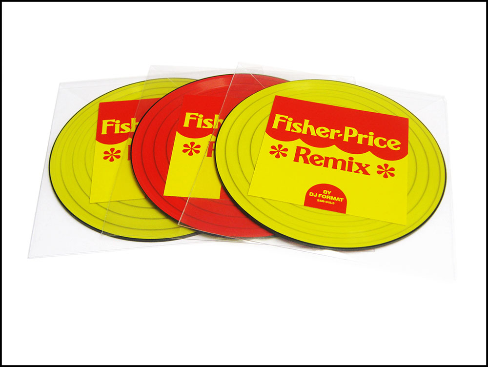
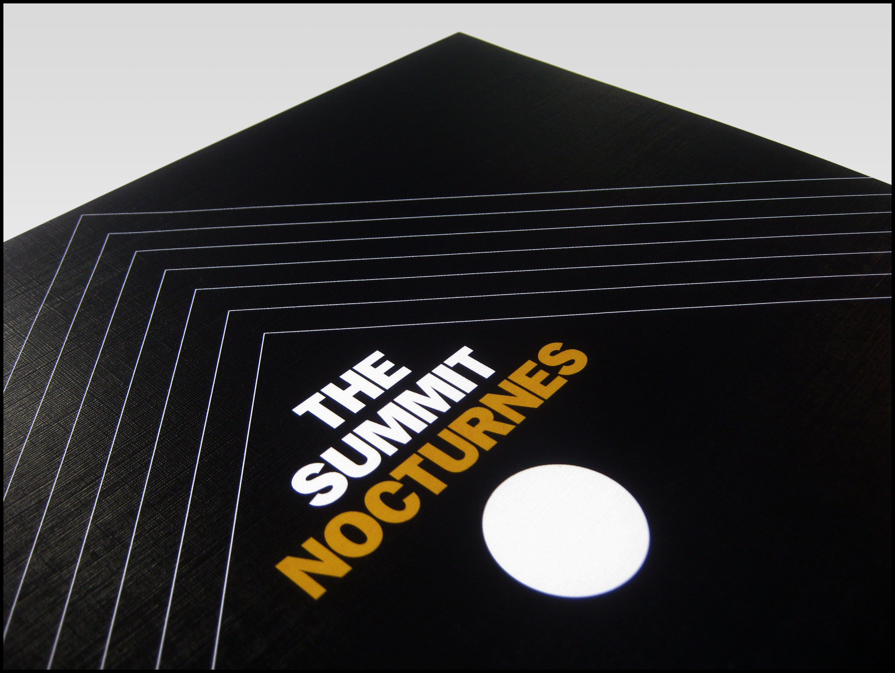
Mr. Krum: Thank you! It’s funny you should say that though as I quite often question and self doubt my work, specifically when it comes to having my own style. Personally I don’t think I do! When I look at artists like Dan Lish or Sub2, those guys without question, have their own unique style – you can instantly recognize their work, in much the same way you could pick out a Roger Dean or Mati Klarwein cover in the blink of an eye. I know it’s different and you can’t really compare illustrators and fine artists with graphic designers, but personally I don’t think the record covers I produce have the same distinct connection between one another. If you take for example DJ Format’s “Statement Of Intent” album and put it alongside The Summit’s “Nocturnes“, they are at completely different ends of the spectrum as far as style and content goes. One is a very busy, ’60s inspired, psychedelic collage with an overload of imagery, the other, completely stripped back, refined minimalism! My aim as a designer is always to try and represent the recording artist or the album’s content, so for each individual project versatility is the key – what is portrayed in the artwork is more a reflection of them and/or their music, and not so much about me. Adopting that approach means I now have a very diverse portfolio of work. Having said that, I’ve actually been sat here thinking about this for quite a while now trying to pinpoint why my work is distinguishable. I know it must be because you’re not the first person to say so – I quite often see people on social media pick up on things that I’ve designed, even when there’s no credit in the caption or comments. I get asked a fair bit to create artwork, paying homage to old album covers or center labels, and again, people just seem to know that they’ve been done by me! All I can think is that it’s more down to the quality of finish and my eye for detail. I’m very meticulous and take great pride in what I do, so maybe that’s what shines through? I’m really intrigued to hear your thoughts actually – is there anything in particular that stands out to you? I never really talk about my work, other than with the people I’m doing it for, so I’d appreciate the perspective of someone from the outside looking in.
Skeme: You’ve worked with quite a few artists who released records, what are some of your favorite pieces that you created?
Mr. Krum: Tough question! I’m proud of pretty much all the records I’ve worked on, and for lots of different reasons. Purely from a selfish point of view though, my personal favorites tend to be the ones where I was given complete creative freedom. As I touched on in the previous question, it’s very important for a designer to fulfill a brief with the clients requirements in mind, which can occasionally mean having to make compromises and do certain things you might not necessarily like or agree with. Being forced to work outside of your comfort zone sometimes produces great results but if I’m being 100% honest and picking personal favorites, they do happen to be the projects where I was given the bare essentials for a brief and simply told to “do your thing”. In those instances I love taking on the role of art director as well as designer so my vision for the complete package is realized from beginning to end. With that said, a few of my favorites include – The Purist’s “Pyrex Scholar” album, the Blunted Astronaut “Sea Of Tranquility” picture disc 12″ and The Process’ “Nocturnes” LP. Not sure how much space we’ve got for this interview, maybe I’ve already surpassed my allocated word count?! Haha! I’d love to go into more detail and explain the reasons for those choices though, if that’s cool?
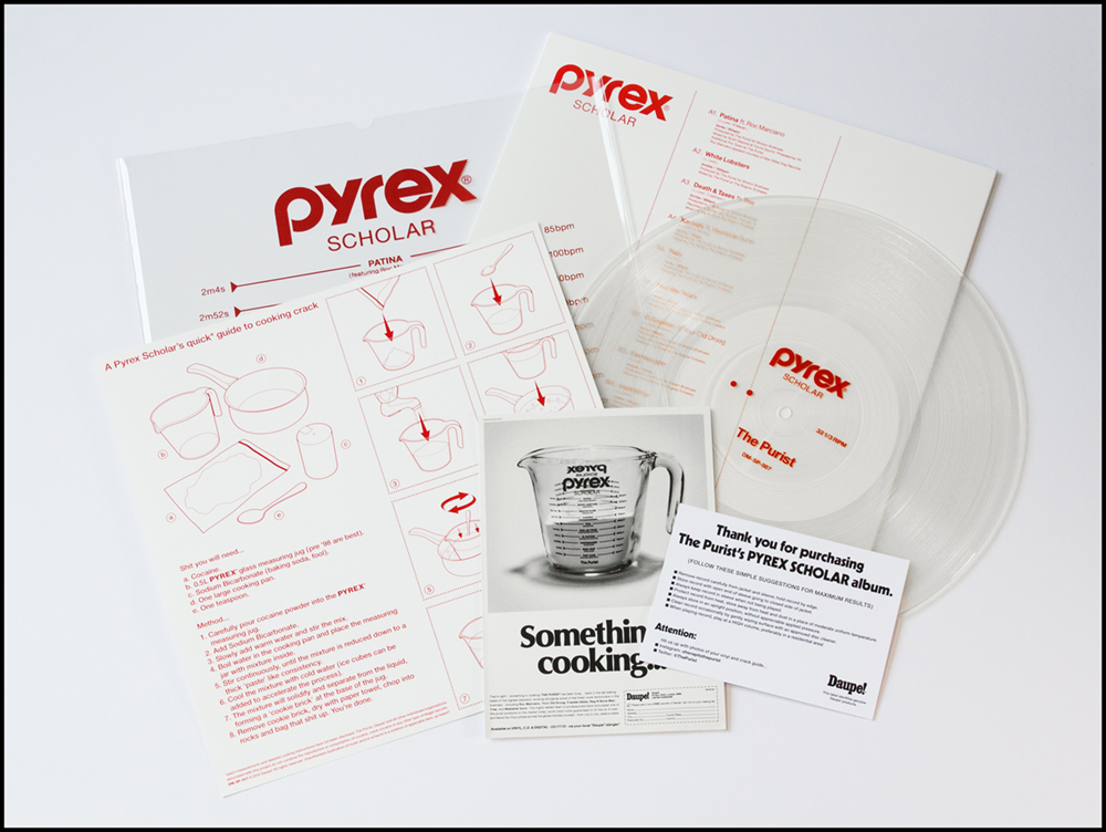
For the “Pyrex Scholar” project the brief consisted of two words; “drugs” and “violence” – that was it! Now, considering we’re talking about an underground rap record featuring Roc Marciano, WESTSIDEGUNN, Freddie Gibbs, Tree, etc, the type of imagery that immediately springs to mind might be something along the lines of the classic front cover photo on the “Mr. Scarface Is Back” LP… you couldn’t get much closer to capturing the essence of those two words! I wanted to do something a little less “in your face” though and sidestep any immediately obvious solutions. I think the idea behind it is fairly self-explanatory and hopefully people who own the record, or have at least seen it, appreciate the angle I was coming from. On a conceptual level and artistically speaking, that project is the most rewarding for me – I don’t often use Photoshop but have to say, I’m real proud of what I did with that Pyrex glassware! The screen-printed vinyl and PVC sleeve along with the jacket, insert and extras make for quite a unique package I think. Shouts to The Purist as well – not many small indie labels would agree to splash out on such elaborate packaging for a run of just 300 copies! Speaking of which, I’m really pleased with how the label’s branding in general has taken shape over the last few years. I’ve been handling the art direction and design duties at Daupe since the first release, working closely with The Purist to help build a strong brand that now has a kind of cultish following. It’s at the point where pretty much every release sells out within a matter of minutes! Now don’t get me wrong, I’m not claiming that’s down to the artwork or anything, obviously the music and artists the label works with are clearly the dominating factor in it all, but I definitely think my input has contributed to the level of quality people associate with and have come to expect from Daupe.
The Blunted Astronaut picture disc is, to me, aesthetically pleasing as a stand alone object but there’s also a very simple, yet understated, concept behind that one which I’d be surprised if anybody, aside from Kuba and myself, even knows about or picked up on. “Sea Of Tranquility” is the title of the main track on the record, and after doing a little research I discovered it was the site of the first manned lunar landing (probably common knowledge to a lot of people but something I was previously unaware of). I thought it would be quite amusing to pinpoint this position on the moon and then place another marker, miles away from it, indicating where a “blunted” astronaut might have ended up landing… waaaaaay off target, haha! Just a silly bit of fun, masquerading as a serious looking piece of design.
The cover art for “Nocturnes” by The Summit, is my favorite example of a minimalist style which I wish I had more opportunities to work in. The design itself has a very stark, very clinical, graphic appearance but is nicely juxtaposed against the tactile, kind of organic feel of the textured, “linen” finish jacket. I loved working with Kevin (DJ Drinks) on this project. Outside of music we also share a lot of similar interests, including a mutual appreciation of mid-century architecture and design. Kevin was keen to reflect this through the artwork and, much like the influential movement we took inspiration from, I think the finished product possesses a timeless quality which also transcends the standards (of your average Hip-Hop record cover). Well I hope so anyway – that’s the idea! There’s a nice little story behind the jackets as well. They were manufactured by a company called Senol Printing, who are based in Croydon, South London. They were the only place that I could find, who still offer the linen finish for LP jackets; it’s a specialist process and not something any of the vinyl pressing plants do so we had to get the jackets manufactured separately. Purely by coincidence, in the evening of the same day I’d first spoke to somebody at Senol, I was listening to an Al Green album and noticed a very small credit on the back cover – “Sleeve printed in England by Senol Printing Limited”. Until that point I hadn’t made the connection – I’ve actually got loads of albums in my collection with sleeves that were printed by Senol! When I next spoke to the “sales rep”, I mentioned that I hadn’t realized they specialized in printing record covers or far back they go. Turns out I was speaking to Jacqui Gunn, who’s father founded the business in 1963, and who’d been running it for the last 30 years. Had a very interesting chat, which resulted in me asking if she’d be happy for us to use the exact same credit on the back of the sleeve; her response – “I’d be delighted!” So, there’s a really cool little bit of history attached to this project, brings a smile to the face of this here geek!
One other release I’d also like to mention, which technically isn’t design, as such, but more a pastiche, is the Test Pressing of DJ Format & Phill Most Chill’s “The Foremost” LP. The attention to detail I put into that was above and beyond, and the reason I’m so proud of it. The idea was to produce 25 individually handmade packages that look and feel as authentic to an “old” U.K. white label test pressing, as is physically possible. I always buy any plain white jackets that have a nice patina, mainly to scan in and use for anything that requires a nice “worn” look, and had collected enough of them by the time I had the idea and put it forward to Matt. The paste-on covers were designed in the style of an old typewriter one sheet, enlarged on a photocopier while experimenting with the tone adjustment, which really pushes the distortion and degrades the text, before reducing it back down to A4. I then tea stained the paper (like we used to do at school to make pirates’ treasure maps!) before gluing them onto the front covers once they had dried. The final touches were added with hand written comments and markings in biro, and then the ink stamping of the labels. God knows how many hours went into making those, was definitely a labor of love, but I’m so pleased with what I managed to achieve, even if they are only appreciated by some twenty or so fellow collector nerds!
Skeme: One of your latest projects that you worked on was The Fabreeze Brothers “Heroes of the East” 12” which you did a dope 3D cover (complete with old school 3D glasses) and beautiful colored splattered vinyl. What prompted you to come up with that idea?
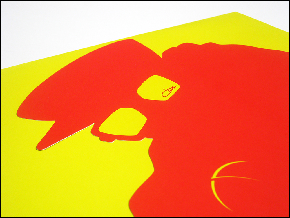
Mr. Krum: The concept came about after receiving the photos from Rez Ones. To be honest, before I’d seen them, I was quite keen to continue the theme from the “No Other Than” 12″ and “Fabreeze Brothers” album, with bold silhouettes and simple red and yellow colorway. I used to love the consistency that was created with cover art back in the early ’90s golden era when you’d get a lead single, album and then a follow up single (or two), all with similar designs (think Brand Nubian’s first three albums and the series of singles that accompanied them). Nowadays you’re lucky to even get a single before an album, let alone a follow up, so I really wanted to make the most of that opportunity. Phill and Paul were insistent that they’d like to use the photos taken with Paten Locke though and when they came through I completely understood why! Rez had captured some great shots of the three of them with a dynamic that instantly jumped out at me as something we could really accentuate through the beauty of old school style 3D printing. I didn’t realize at the time what I’d let myself in for and highly advise anyone against attempting to work in this format – it literally is, a huuuuge headache! Staring at a computer screen through 3D glasses for hours on end while trying to design something that works on a number of levels (functioning correctly for viewing through the eyepiece as well as a stand alone image) is enough to make a grown man cry! If I went into detail about the technicalities involved, we’d be here all day… but what I will say is – NEVER AGAIN!!! Now the finished product is out, and seeing how much people are enjoying it, makes the effort worthwhile though. Have to say a big thank you to Mr. Fantastic for bearing with me and helping resolve all sorts of technical issues along the way.
Skeme: Another project you’ve recently worked on is the new Black Moon “Enta Da Stage” reissue set which looks amazing by the way. How did working on that project come about and what was your involvement?
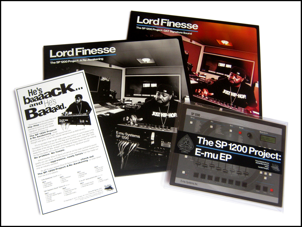
Mr. Krum: Thanks Skeme, I’m really pleased with how it all came out! That was through Bert at Fat Beats. I’d done some work for him previously and he reached out to explain what they were doing and asked if I’d be interested in handling the design – needless to say I bit his hand off! “Enta Da Stage” is one of my favorite Hip-Hop albums of all time! I still have to pinch myself when working on projects by artists I grew up listening to, and who made some of the most cherished records in my collection! Got to give a shout to Rich at Slice Of Spice who’s also given me the opportunity to work on some great releases by the likes of Lord Finesse, Organized Konfusion, O.C., Showbiz & A.G., DITC, Marco Polo, Jeru The Damaja, etc – thank you my man! So yeah, Bert outlined the project, which was initially only penciled in for a vinyl release, sent over a folder full of images from the original Chi Modu photo shoots and asked how I envisaged it all coming together.
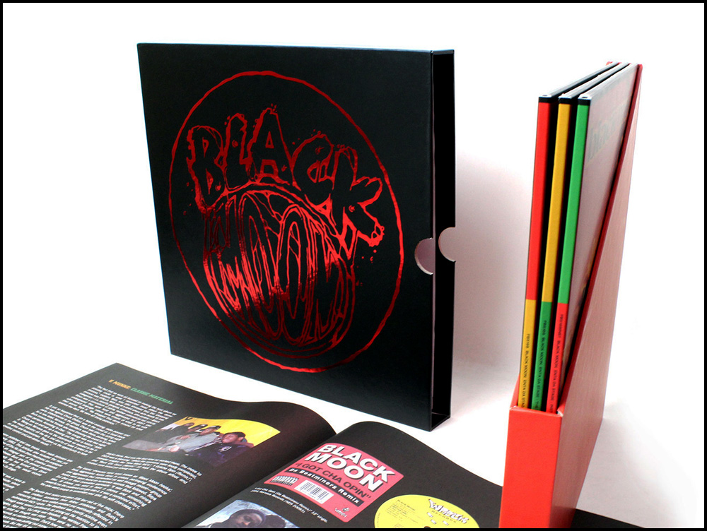
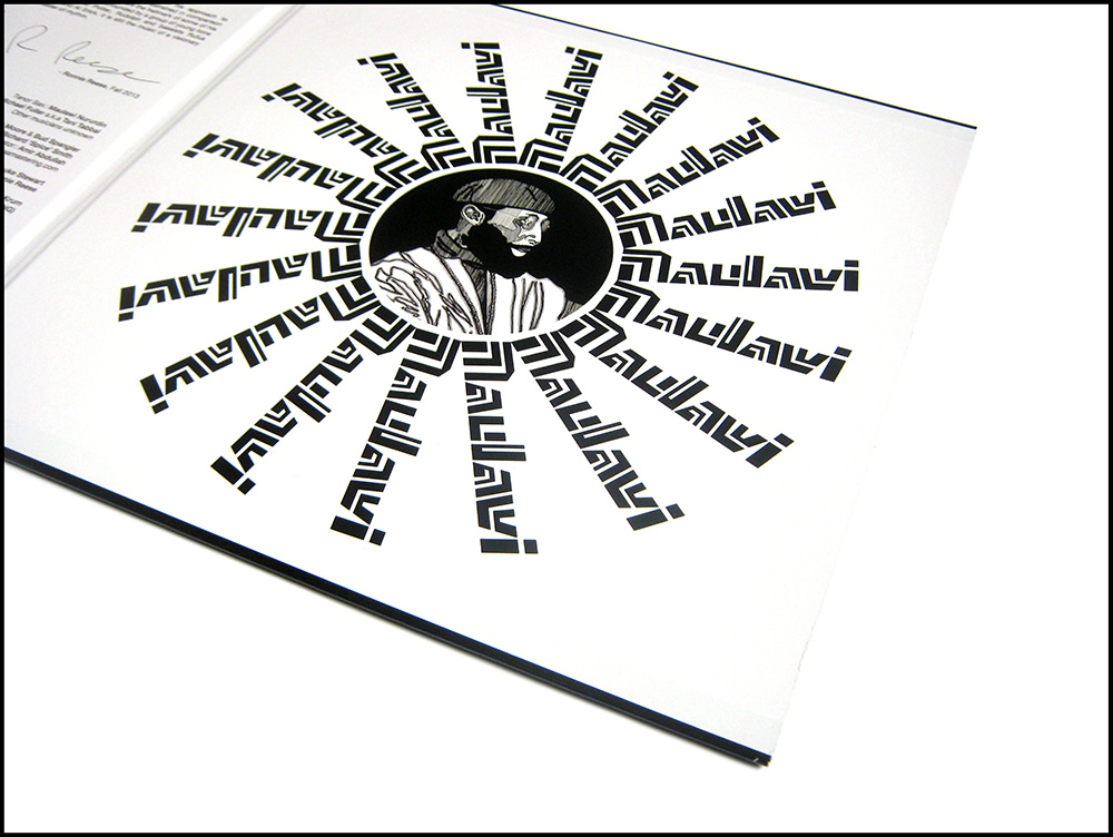
First and foremost, coming from a fans perspective, I knew for a release like this I would want to see a package which expanded on the existing artwork, instead of trying to redesign it, so with that in mind I set about rendering the original layout from scratch and then utilized the same basic template across all three records, switching up the images and color combinations. Simple but effective but I must admit, there’s a few design elements within the original cover art which, for me personally, are big no-no’s – in particular the “stretching” of fonts. I’ve always had a strong dislike for that practice. To my eyes it usually comes off just looking like a lazy attempt at trying to make some text that doesn’t fit, fit! I appreciate it was somewhat of a trend in the late ’80s and early ’90s though, so chose to just embrace it instead of attempting to “correct” or improve upon it. I guess it’s kind of subjective anyway – who am I to say what’s right or wrong when it comes design?! And speaking of “right or wrong”, another little dilemma that tested my OCD tendencies was the way “Who Got Da Props?” is written differently across various formats on the original releases. “Who Got The Props”, “Who Got Da Props?”, “Who Got Da Props!”…which way is correct?!!! On the 12” the track is credited as “Who Got The Props”; on the album cover “The” is replaced with “Da”, so “Who Got Da Props?” (also with the addition of a question mark) and then I noticed on the album center label the punctuation differed from the jacket, with an exclamation mark replacing the question mark! Sorry, I’ve just realized I’m going into far too much detail and waffling on about minor discrepancies that I doubt too many people would even notice or care about! To answer your question more directly, haha, I was the art director and designer for everything you see across all formats, apart from the Test Pressing archival boxset, which was expertly put together by Chris Hund at Fat Beats. I did the design and the ink stamp though, which I thought was a nice touch and something a few hardcore collector nerds will I’m sure, appreciate! 😉
Skeme: What’s in your daily listening rotation when either creating or hanging around that house?
Mr. Krum: During the day, I predominately listen to Hip-Hop, maybe 80% of the time. I’ve been like that since my teens! The last couple of weeks I’ve had O.C.’s new album on constant repeat. I must admit, some of tracks, musically, aren’t to my (slightly old fashioned, stuck in the past) kind of taste, and I’m a beats before vocals man so usually if I’m not feeling the music, no matter how good the emcee is, I tend to switch off. O.C. is as sharp as ever though and goes in on a lot of very poignant topics with the usual swag and charisma that perks your ears and demands attention. For anyone who might have been sleeping on this album – don’t! Cop the free download and if you like it, support the artist and buy a physical copy – DITC Studios have both vinyl and CDs available to preorder through the DITC Entertainment website. On a side note, I’m still fiending to hear the project he recorded with Damu a few years ago – would love that to see the light of day – ReDef, if you’re reading this, PLEEEEASE make it happen! Usually when I’m sat at the computer I’ll be listening to whatever project that I’m working on, or if I don’t yet have the music, more than likely I’ll be catching up on one of two radio shows – either The Grown Man Rap Show (presented by Paul Nice & DJ Toast) or Southern Vangard Radio (hosted by Jon Doe & Eddie Meeks). Very rarely do I play records during the day, simply because I don’t have time to keep pulling them out the shelves, removing them from the sleeves and then flipping them over every half hour or so! Far more convenient to play digital files during working hours and savor the interactive side of listening to music on vinyl in the evenings and on weekends. When I’m cooking I seem to be drawn to Jazz or Easy Listening at the moment but I’ll go through phases and sporadically revisit certain artists or genres in my collection…next week I might be heavily into Soul and Funk again which will no doubt lead to me craving for loads of records I don’t own, while at the same time telling myself to just enjoy what’s here!
Skeme: Aside from being a designer you’re a record collector, but coming from a designers perspective and eye, what attracts you to a possible score when out digging?
Mr. Krum: To paraphrase a very old saying – you can never judge a record by its cover! As I mentioned earlier, my job as a designer is to try and portray the content of an album through the artwork, so the potential buyer hopefully gets a good idea of what it might sound like. Years of digging, across all kinds of genres, has taught me that this is by no means a universal approach though! I’ve taken “blind” punts on plenty of records with amazing sleeves, only to get home and be hugely disappointed by the music! Cover art can definitely raise or lower your expectations of the music (much like, the very often misleading, track descriptions on the back of Library albums, haha) but it’s a bit of a minefield really, very hit or miss, and particularly, I find, with Easy Listening records! It’s all part of the fun of digging though! I try not to overlook anything based upon initial impressions of the artwork, there’s always a number of other factors to consider; label, year of recording, musicians, songs, instruments, etc. – all details that are scanned over and collectively assessed before making a final call. Do you ever think about how amazing our brains are in relation to digging?! How many thousands (possibly millions?!!!) of covers and center labels are memorized and stored away up there, able to be processed in a fraction of a second, so whilst we’re flicking through the racks, we are able to differentiate between all those familiar records we’ve previously seen and know can be dismissed, and those we need to stop at and pull out for closer inspection – seemingly without even having to think about it! Imagine if we could print this data out – a list of every single record you’ve ever laid eyes on! I’m sure the stats alone would be pretty jaw dropping but I’d love to know, in hindsight, what records I passed by in the early days. Bet there’d be plenty of cringe worthy “oh shit!” moments reading through such a list. All the weird Easy, obscure private pressings, unknown disco 12″s, etc., that I overlooked! Bloody hell, sorry I’m babbling on again about nonsense! At the end of the day, as much as I love a great piece of cover art which draws my attention, I’m at the point now I think where a lot of it just comes down to intuition, something that you acquire through years of experience, a weird sort of spidey sense – the “diggers hunch”!
Skeme: What are your top 5 album covers of all time (without naming ones that you’ve worked on)?
Mr. Krum: I could spend hours, possibly days, painstakingly deliberating over this question and doubt I’d ever be able to choose a definitive 5 so I’m just going to name the first ones that come to mind without thinking about it too much.
- Bill Evans & Jim Hall “Undercurrent” – is always at the top of my list. A hauntingly beautiful photograph that never fails to induce a complete state of awe every time I look at it!
- Any Reid Miles ’60s era Blue Note – the GOD of record cover design, period.
- Gravediggerz “6 Feet Deep” – photography and design, across the front, back the inner sleeve – all 10 out of 10 for me. It’s a perfect visual representation of the music.
- Ol Dirty Bastard “Return To The 36 Chambers” – great concept, brilliantly executed with superb attention to detail.
- Fat Boys “Fat Boys” (Pizza Box & picture disc) – not so much for the “cover” art, but rather the design and presentation of the package as a whole. Get On Down are consistently pushing the envelope conceptually, making it extremely hard to resist buying releases which you probably already own a couple of times over! Gimmicky maybe, but why not?!
Arghhhh!!! Since first writing this I’ve thought of tons that I could easily have included! Cream’s “Disraeli Gears”, Hijack’s “The Horns Of Jericho”, near enough any CTI, Pharcyde’s “Bizarre Ride…”, Dick Hyman’s Moog LP’s, Placebo’s “Ball Of Eyes”, etc, etc. the list is endless!!!!
Skeme: What are you on the hunt for when you’re out digging these days and do you dig for anything else aside from records?
Mr. Krum: The only records I’m actively seeking out, be it online or in proper shops, is a select amount of Hip-Hop 12″s and albums – mainly promo only bits and some choice obscurities from the late ’80s/early ’90s that I still need. Unfortunately, most of the titles in my wants/saved search list rarely get offered for sale and tend to be VERY expensive when they do. There’s plenty of great records which sell for peanuts now though, so I’m always filling gaps and minting up whilst holding out for my personal grails to turn up at a price I’m happy to pay. I don’t get sucked into trends or buying crazes – there’s not a single record I feel I need to own that badly which I can’t wait for. Take the 45 thing for example, particularly Rap 45s… some of the prices people pay for stuff are crazy! I love finding them for cheap out in the field but it’s only the novelty value that appeals to me really, I’m more than happy to be buying the “big ones” for a couple of quid instead of a the “little ones” for a couple of hundred!
When I’m out “digging” though, I’m not really looking for any one thing in particular. The enjoyment for me is as much about the hunt and catching whatever is out there on any given day. Obviously records are always the main focus, and I’ll take a punt on anything that looks interesting if it’s cheap enough, but in all honestly I’m looking at pretty much everything – books, magazines, tapes, videos, furniture, ornaments, clothes, trainers, general bric-a-brac, etc. Just like your self, I’m very nostalgic and slightly obsessed with certain bygone eras. Finding something as trivial as an old 1970s Tower Records pin badge in a charity shop is like discovering treasure to me! I love rescuing stuff that might otherwise end up being disregarded, forgotten about and lost forever. But apart from records, I really wouldn’t consider myself to be a specialist “collector” of anything – more just a hoarder of random objects that personally appeal to me! I have a decent amount of vintage boomboxes and portable record players, a couple of hundred blank cassette tapes by brands from all over the world, plenty of old record shop bags, various press photos and promo items, etc. but I’d never claim to be an expert, and definitely couldn’t compete with serious collectors, in any of these fields – I just buy stuff I like! Actually, my stash of mid-century Penguin and Pelican books is pretty strong, but then again, I’m sure there are plenty of people out there with collections that would easily put it to shame!
Skeme: What does Mr. Krum do when he’s not in the lab creating?
Mr. Krum: Aside from spending time with the family, there really isn’t anything I enjoy more than trawling charity shops, car boot sales, household recycling centers (I prefer to call them “dumps”), junk shops, jumble sales, you name it… anywhere the slightest whiff of dusty old vinyl leads me. I could go out all day everyday and still be hungry for more! Unfortunately, and no thanks to people like yourself (said tongue in cheek), I’m also slightly addicted to social media – reading up on other peoples digging adventures and new discoveries. The wealth of knowledge being shared on the internet is amazing and makes you realize that this journey of ours “searching for the perfect beat” really is never ending! So, much respect and a big thank to you Skeme, and to all the other dedicated music lovers out there who put in work to help keep our generation’s culture alive.

